

39 Podcast Cover Arts That Convert Us To Listeners
39 Podcast Cover Arts That Convert Us To Listeners
Decoding what makes us click them, and how I made one on a zero budget.

Full disclosure: I’m a producer for a show seen in the article (East Asian Story).
Don’t worry, it won’t damage your eyes to see it, unless you’re allergic to shameless plugs. 😉
Convince me otherwise, but the number one single indicator that defines a good podcast cover art (and title) for me is whether it converts people to click and listen. 👉🌇
So in this article, I’ll share what I learnt about how to create one that optimises for it.
We believe in quality over quantity. These pieces take WEEKS of care to craft and maintain. Subscribing and SHARING keeps us pumped and helps us in a long way! 🙇🏻♀️❤️🙇🏻♂️
BEFORE THAT, WHY DOES IT EVEN MATTER
I always find this ticklish yet gut-wrenching.
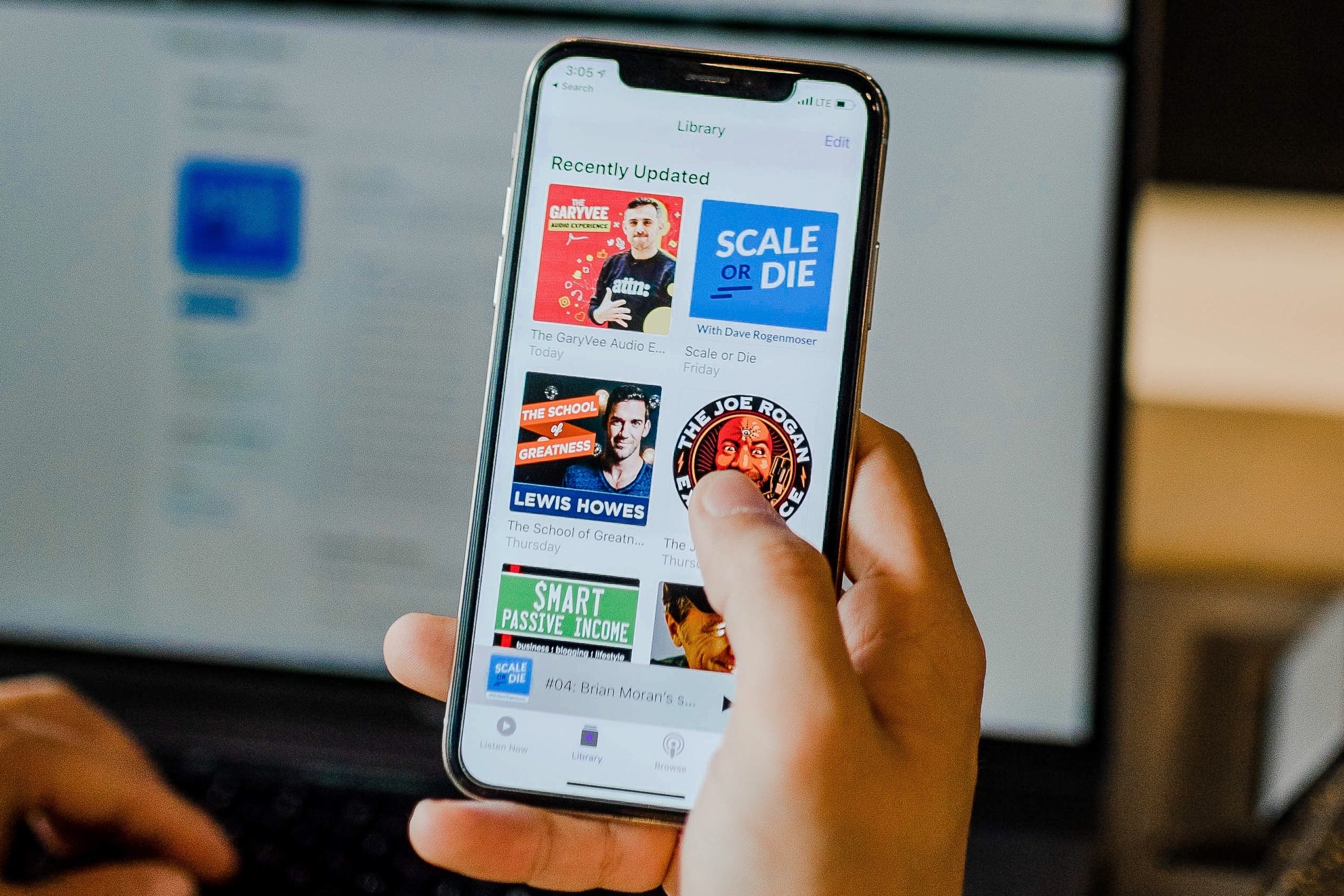
One of the greatest ironies of podcasts is that a proportion of your prospective listeners will decide whether to listen to your show based on how it looks 🙉, rather than the audio itself 🙈.
Unless you already had a rabid follower base, stellar recommendations by authorities, wildfire-level word-of-mouth, or buckets of the holy juice that make everything possible 💸, chances are many listeners’ first impression of your podcast will be through your social media posts, podcast directories browsing or, worse, their highly-coveted front page of recommended shows.
So optimising your podcast cover art to seduce people to click is a no-brainer.

HOW MY THEORY CAME ABOUT
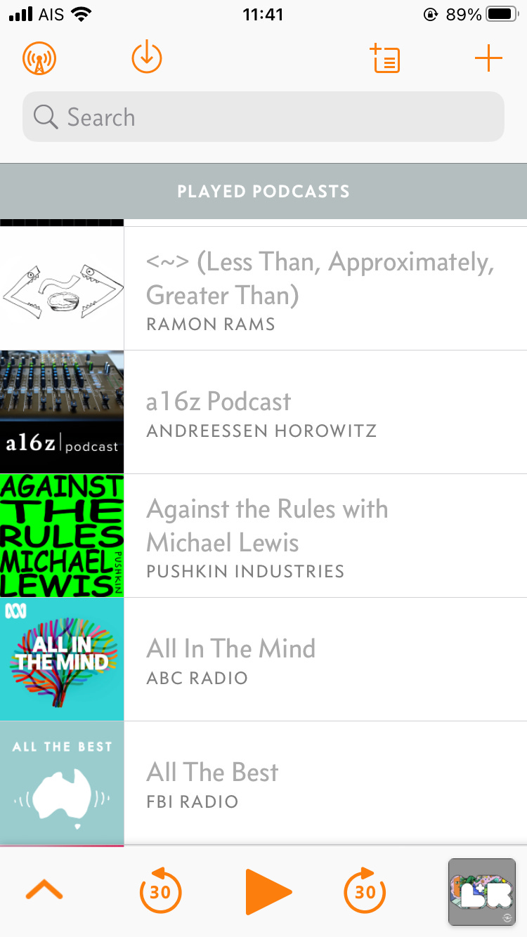
I listen to A LOT of podcasts as a producer and spend even more time finding new ones, so I think about the mental model of what persuades me to click all the time.
I wish we could have the conversion rate statistics to scientifically test it but alas, the directories do not provide such data. So an educated guess will have to do for now.
Anyway, below are my observations 🧐.
THE MINIMAL REQUIREMENTS
Your podcast cover art isn’t more clickable with them, but will be doomed without them.
1. It’s visually comprehensible within a split second ⚡
Think of the approximate time it takes for you to swipe again while browsing. The way to do this is to have just one single focus point on the artwork that is also visually simple and clean.
2. As long as it still makes sense, the smaller the better 🐝💨
I usually stress test to see if it still works at 80x80px on a laptop (arbitrary), and in various podcast directories on a mobile phone.
That’s also the reason why all the cover arts I will use as an example in this article will be shrunk to the above size; I’m playing as a devil’s advocate here.

3. It catches attention or stands out 🐝💨⚡⚡⚡
This depends on the surrounding, although the one hack I found that always works is through using flashy colours… although this can be a bit annoying.

A debatable point 😤
I personally think it’s optional whether people need to be able to understand what your show is about right from the cover art itself. My position is that as long as it caught their interest to click and learn more, it served its purpose. Convince me otherwise.
HOW TO INCREASE CLICKS ON THE COVER ART
There are 3 broad reasons for what makes me click. The key is to optimise for all of them.
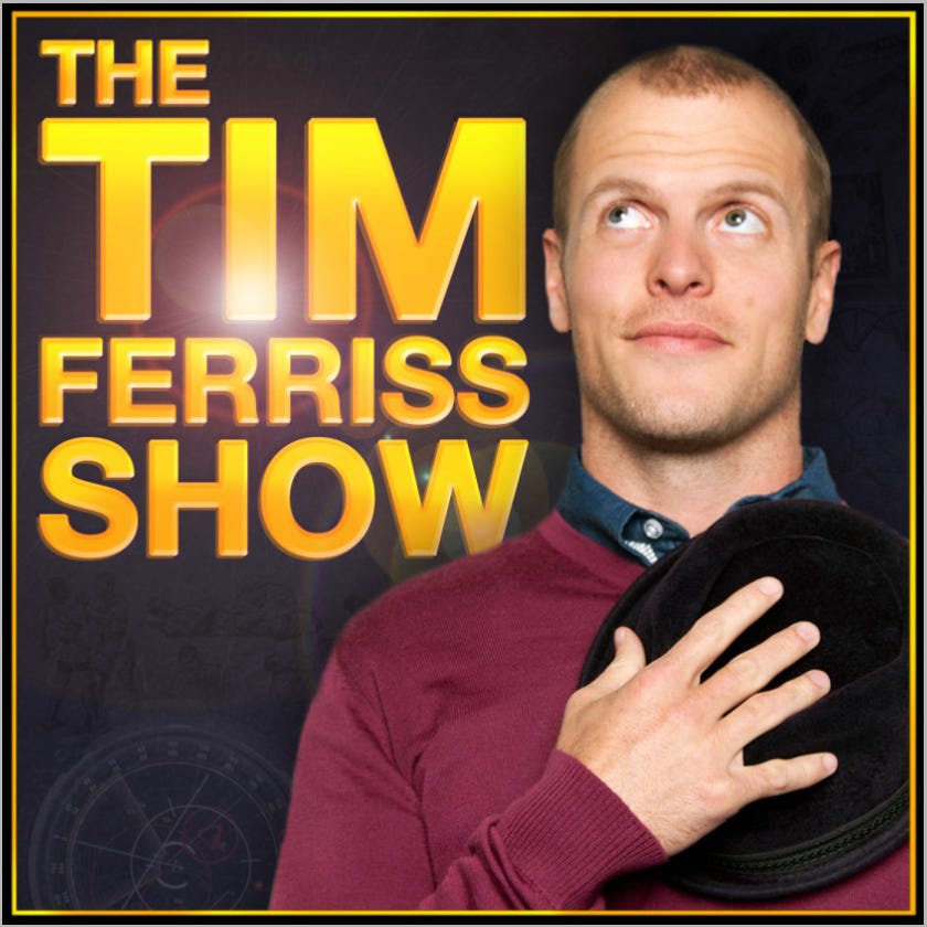
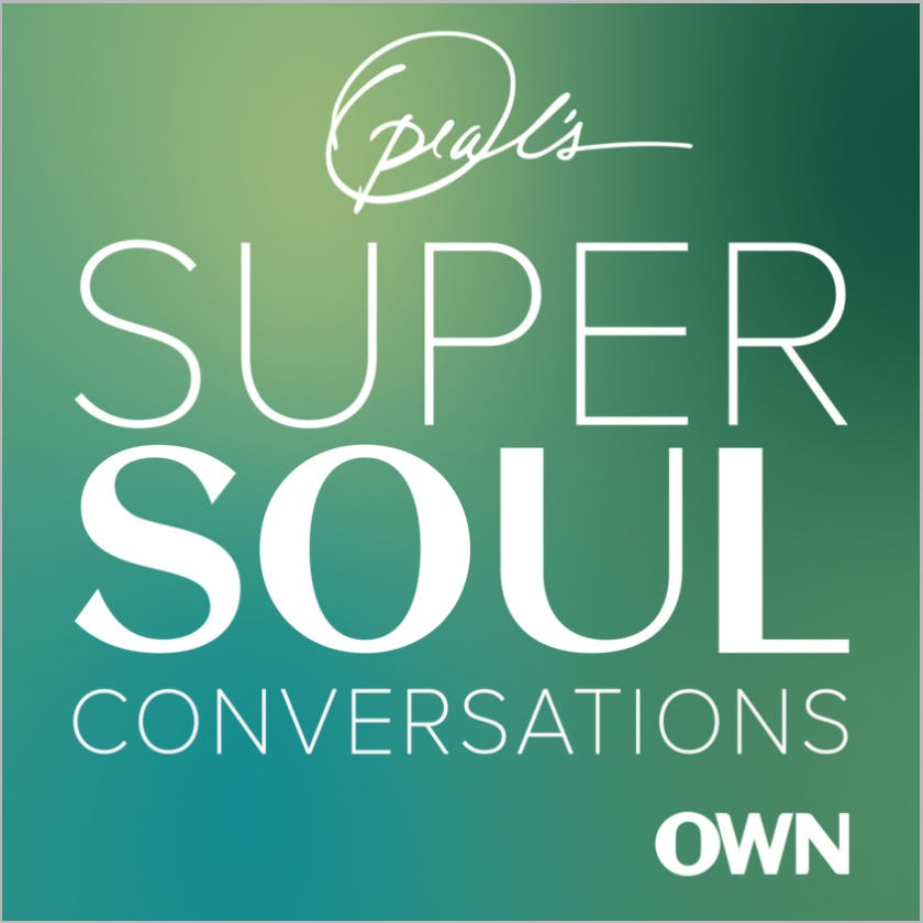
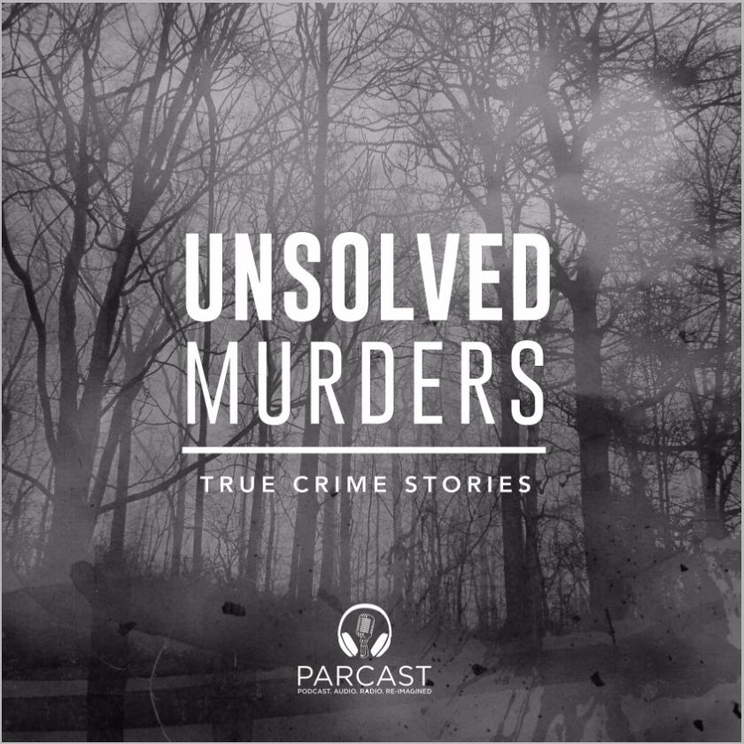
1. I Have An Existing Relationship, So Utilise It 🤟 (6)
“Oh I love this brand! You do a podcast too? Nice!”
In this case, the clearer your brand is on the cover art the better (size, contrast). Let’s look at some examples.
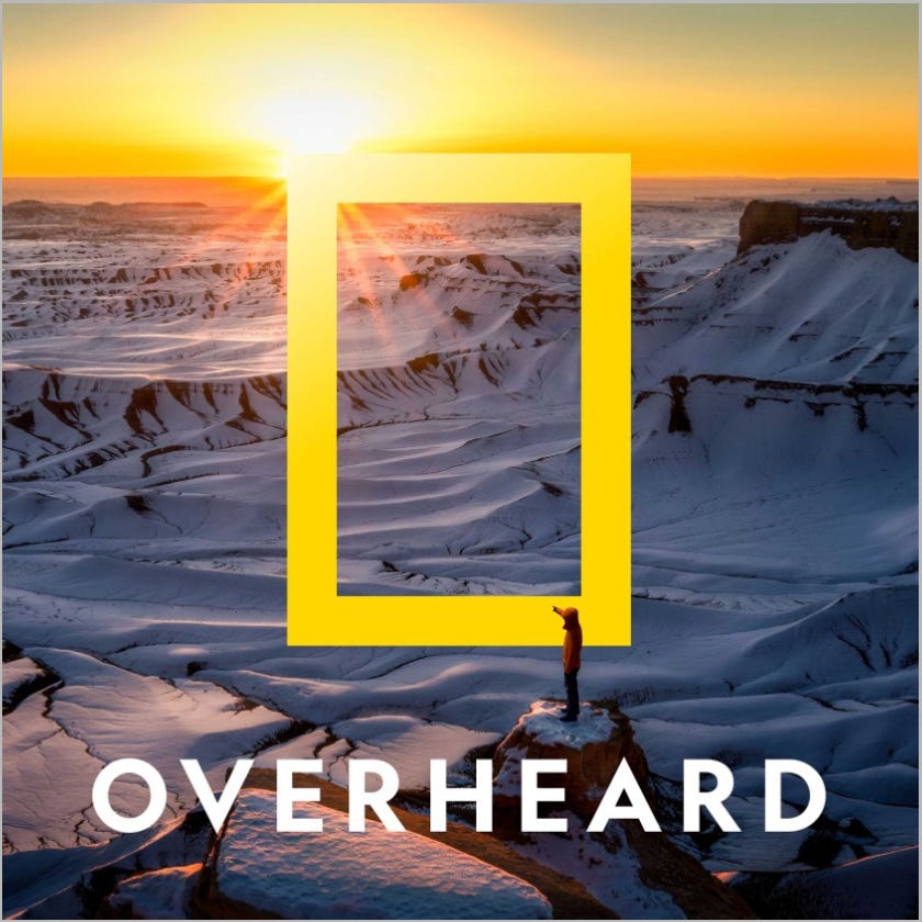
Institutions 🏰

Personalities 👸
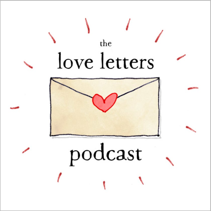
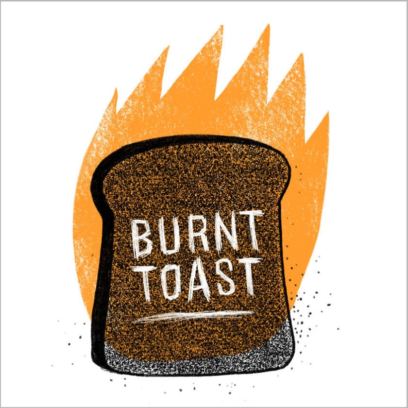
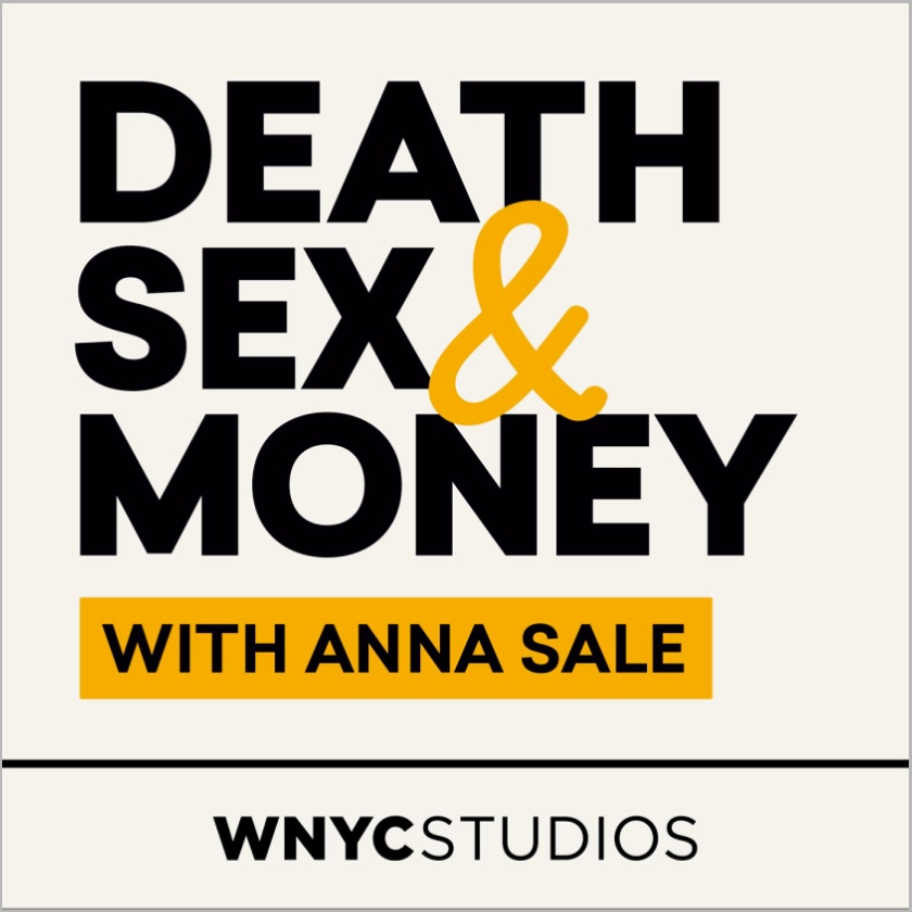
2. It Matches My Intentions Or Interests 🤜🤛 (6)
“Finally I found it! Someone out there that understands me!”
Naturally, your target audience should be very well defined and researched to pull this off. There are 2 types of cover art for this category.
By show title 🗯️
The more specific and niche the title is, and using SEO keywords, the better. So make it the clearest (size, contrast).


The risk for not incorporating the show title in the artwork, though, is that people might miss it if they only browse shows by the images (more attention-grabbing).
By symbols or images ☣️
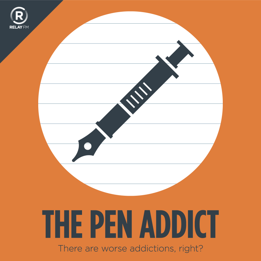
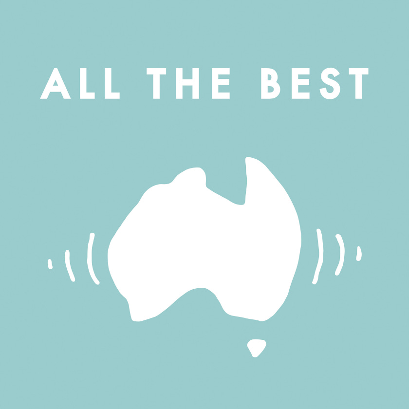
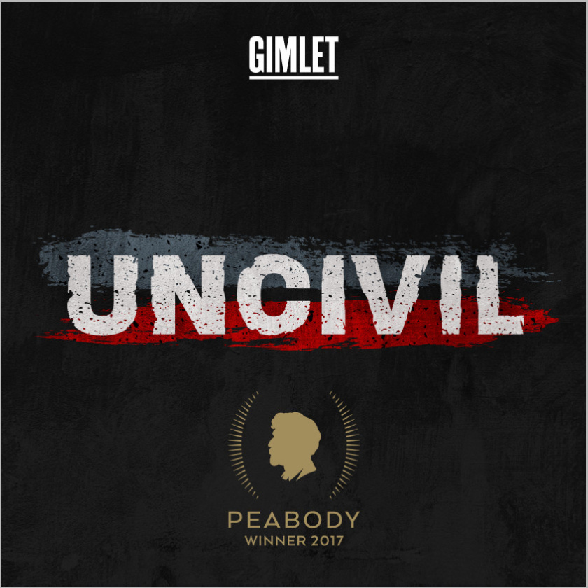
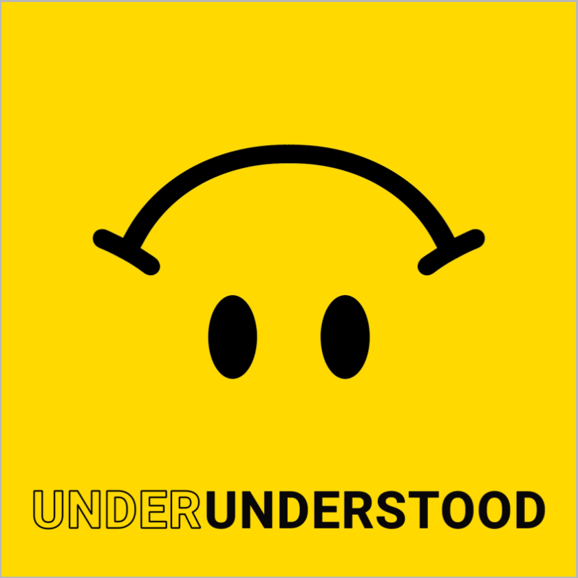
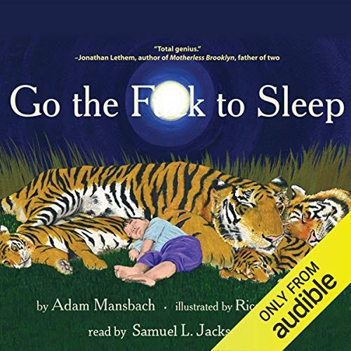
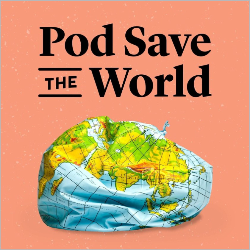
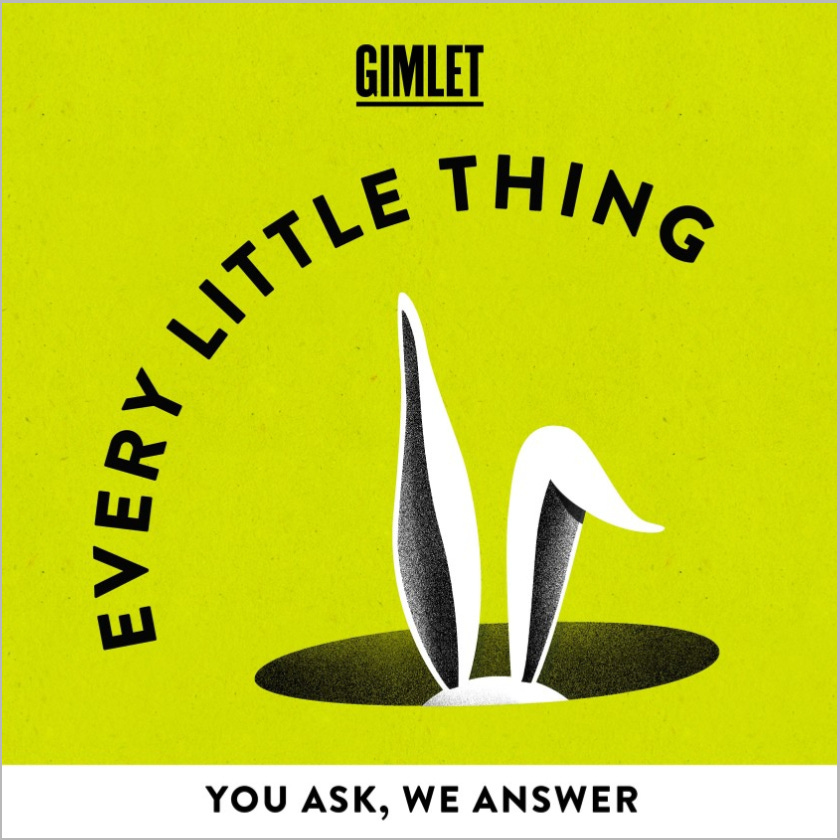
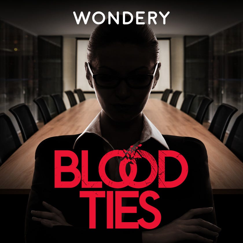
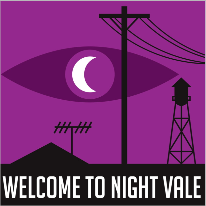
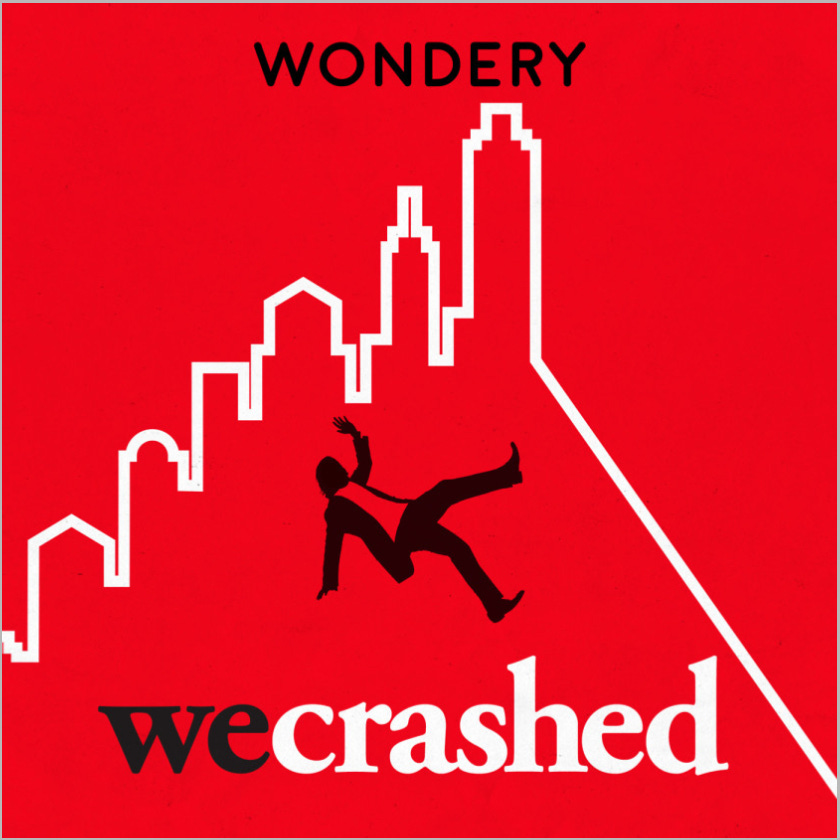
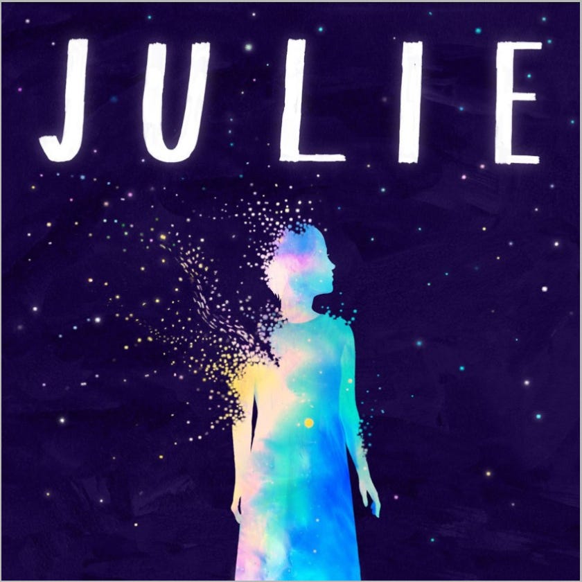
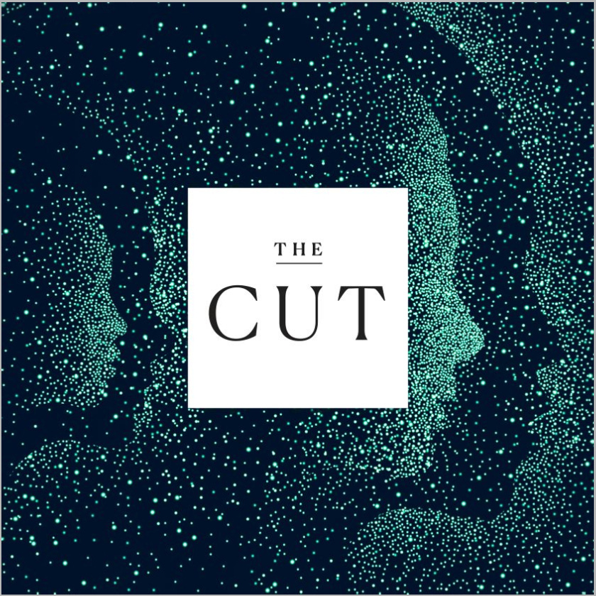
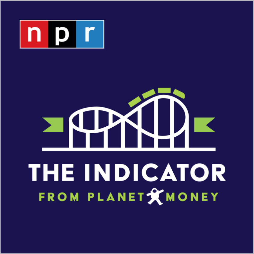
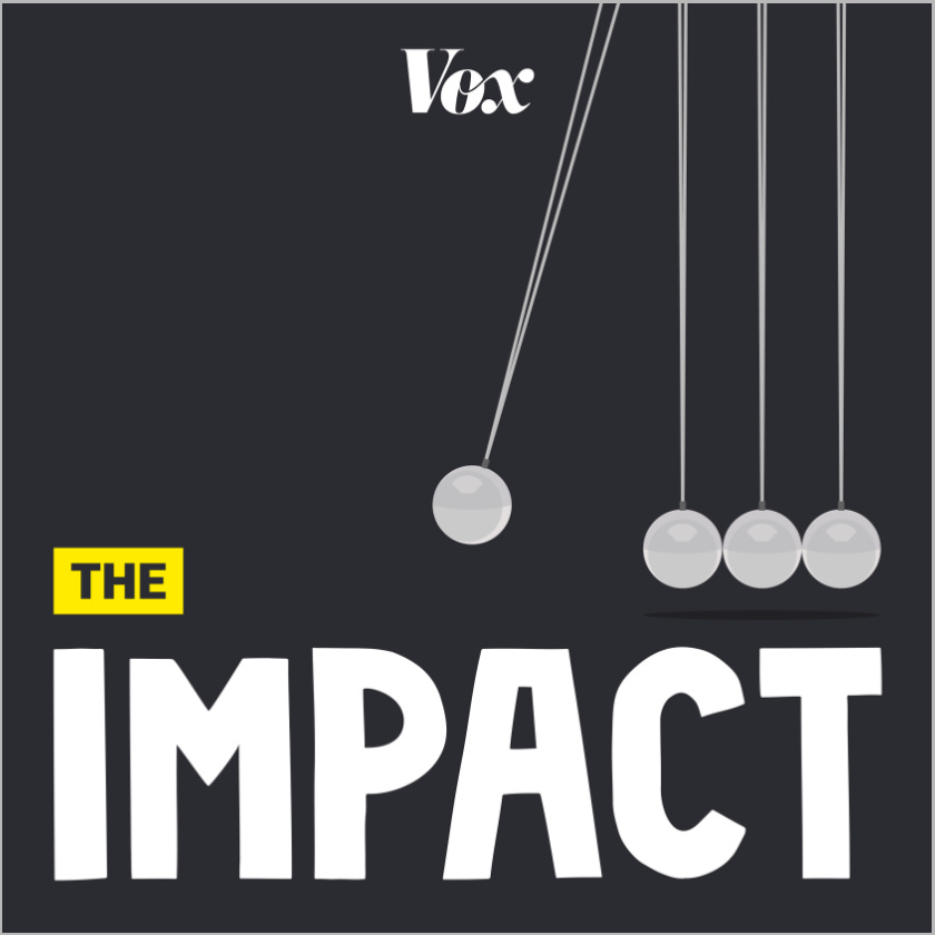
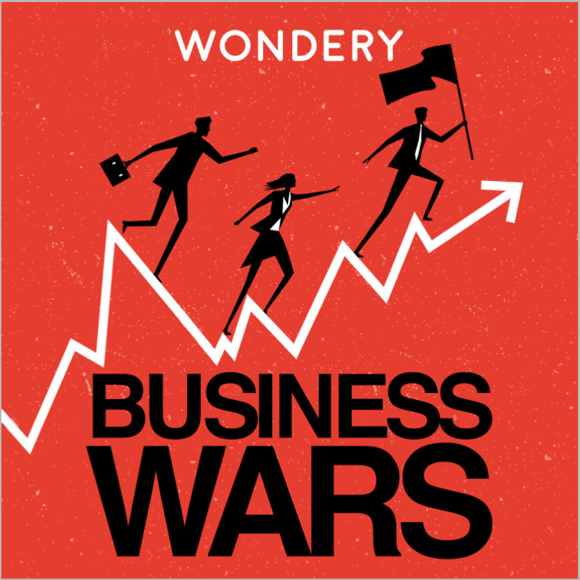
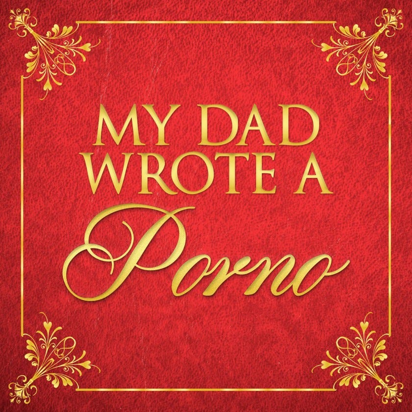
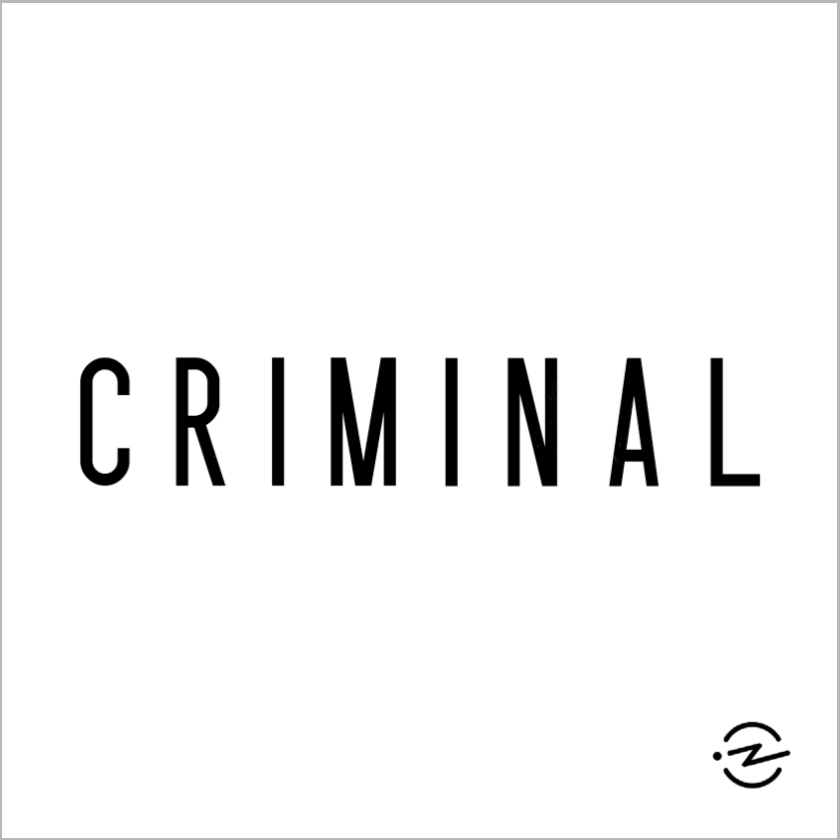
3. It’s Emotionally Engaging 🖕 (18)
“The cover art looks interesting. What’s this about?”
In this case, you simply optimise for an emotion, ideally about your show’s audio aesthetic that they can expect. The more it hits a nerve, the higher probability of clicking.
Fun / Hilarious 😽

Mystery & Conflict 🤡


Intimate 😌


“I don’t know what its about but WOW” 🤩 — polished and highly-produced

BUT THEY ARE NOT MUTUALLY EXCLUSIVE
That’s right. You can optimise for all 3 reasons at the same time. A quick recap:
Importing any pre-existing relationship 🤟
Matching audience’s intention or interest 🤜🤛
Making it emotionally engaging 🖕
Some examples that fire on all three cylinders (5)


STILL, QUALITY > QUANTITY
A single persuasive reason alone is way better than multiple weak reasons combined, trust me. 😁
FINALLY, HOW TO MAKE ONE AT ZERO BUDGET
All you need is a bit of creativity 🤸 and some amateur DIY-level ability to create a digital image 🌠🧙.
Anyway, from the above examples, there are 4 different types of cover art that you can make yourself, focusing on different aspects:
A strong brand

An interesting show title
A simple but powerful graphic


A beautiful stock photo for the background
Bonus: maybe even using a filter for a dramatic effect
Just take a pick of a concept from any of the above and mash it with your show to see what could work.
That’s also pretty much how I made mine as you’ll see. 👇
HOW I MADE MY OWN COVER ART
The Starting Point
My podcast is called East Asian Story 🌏. It’s precisely about what the title suggests, an interest-based keywords title.
I should have made the title more niche but I didn’t know the direction I was taking it then so I left it at that. 😛
Anyway, this is the original version of my podcast cover art when I first started.
I don’t have any existing following and the logo doesn’t even show all the 3 keywords that might attract people who are interested.
Essentially I can’t think of any reason why people would click on this. 😞
The Creative Process (6 months)
I first began producing a few episodes to narrow the show concept and aesthetic. 🌱🥚🌱
Ultimately it ended up being an audio documentary about how to navigate the unique struggles that my wife and I encounter living in East Asia. Imagine Millennial or StartUp but for East Asian, with a hosts’ dynamic like Reply All.
I then had to find a concept that represents the show and fits all the minimal requirements I mentioned above. ✨🦎✨
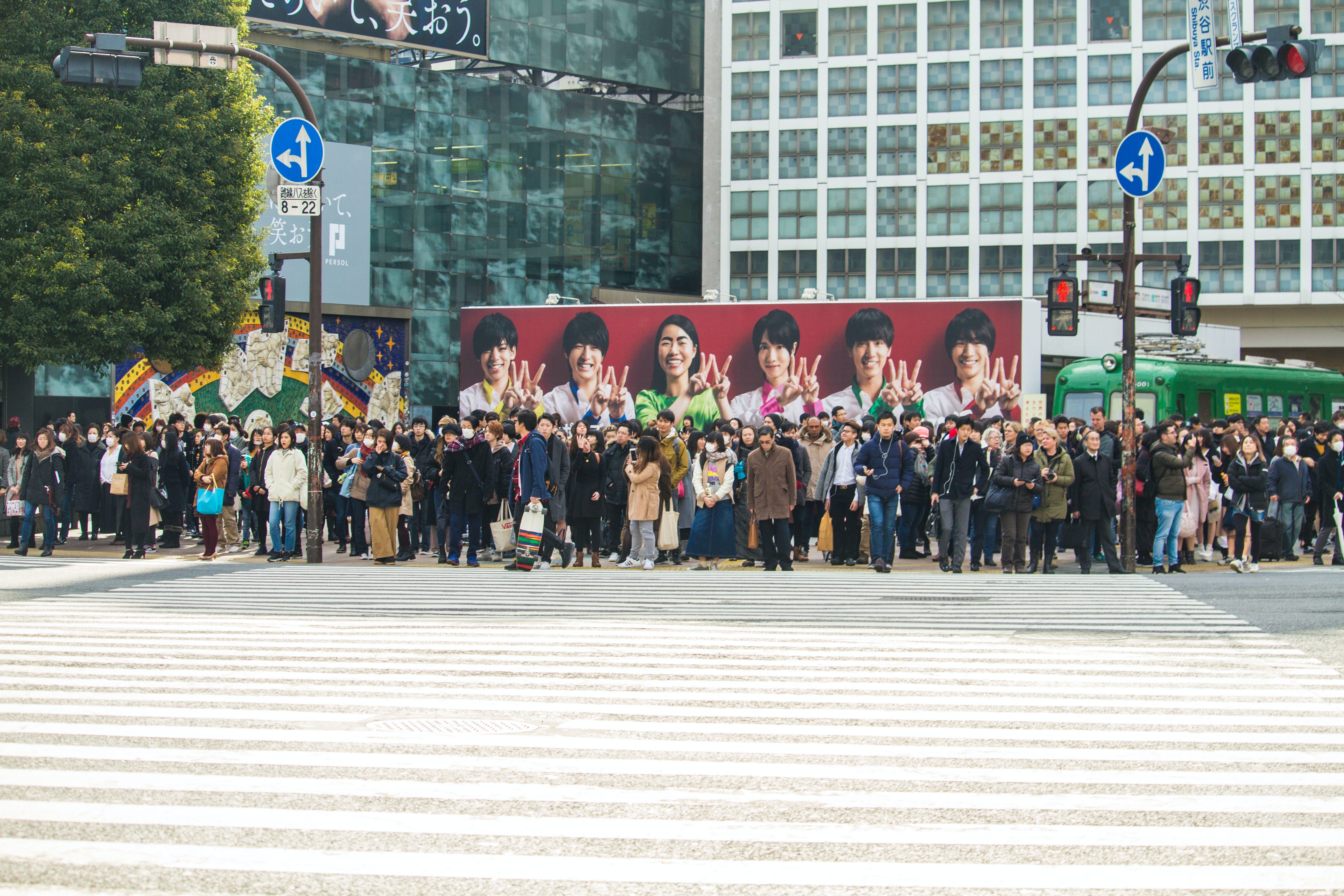
I wanted a symbol that is distinctively East Asian, modern, and globally recognisable. Long story short, I found this podcast.

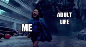
I also remembered how my wife and I used to joke about our lives being precisely encapsulated by this meme. 💦🐊💦

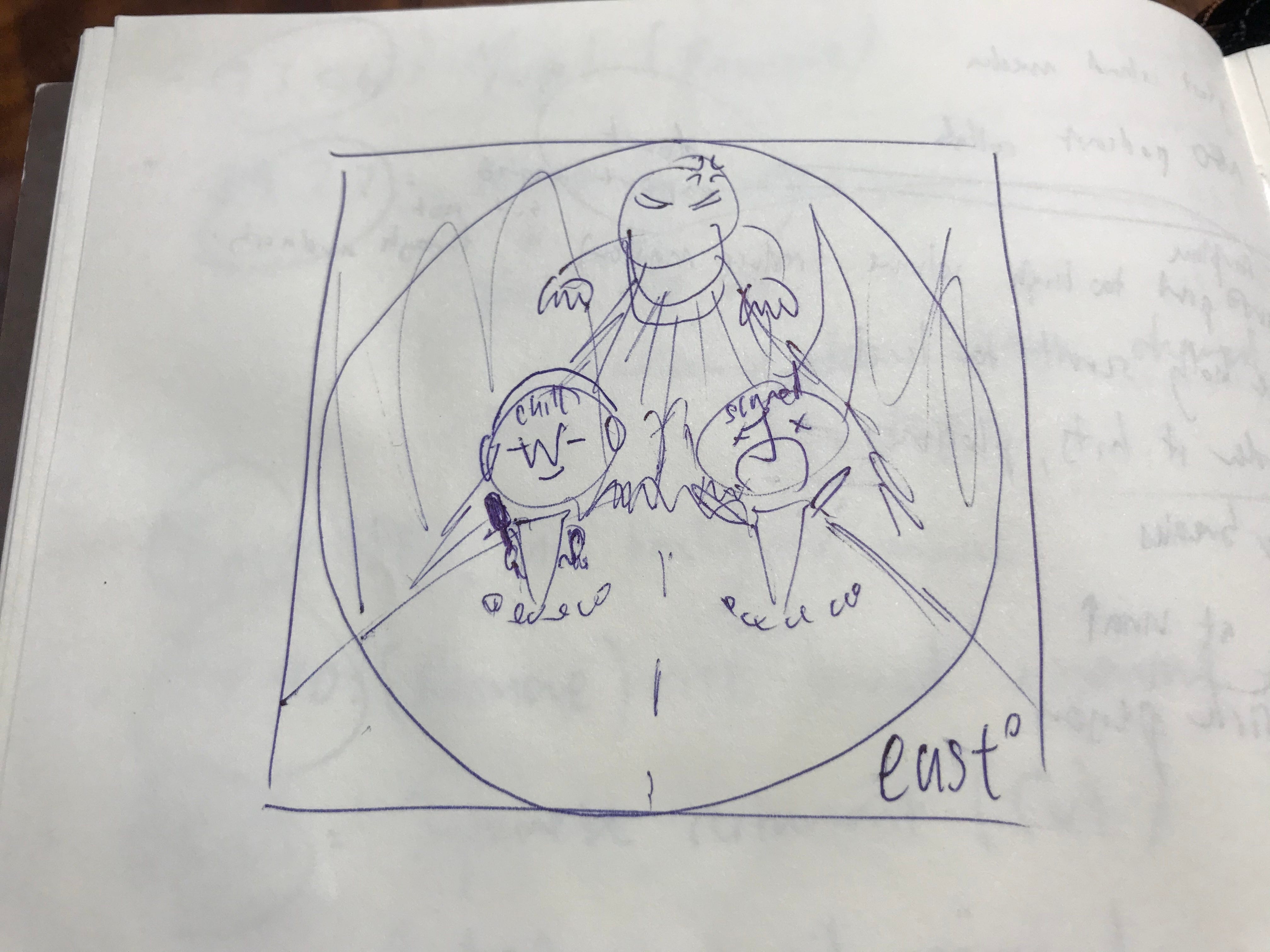
And there we have it, the basic concept. Below was my quick and dirty drawing of it, with little flames as the finishing touch. 🔥🦖🔥
The Production Process (2 days)
I wasn’t yet confident about fully committing to this concept, not enough to warrant hiring a professional graphic designer, so I decided to DIY a prototype first. 🤔
I’m lucky that my wife knows how to do some basic drawing and colouring on a tablet (but not to a professional level). That was sufficient. I would have scrapped this concept had I not gotten this advantage.
So I begged her to help in exchange for treating her to a nice meal.
🙌 🔜 🍱🍖☕ 🔜 💖🙆🏻✍️
This was what I got in return.

The white empty background was way too plain for my taste though, but we had no skill to draw an elaborate one. So I thought really hard… and then Aha! 😃
I first erased the white background to make it transparent and converted the file to PNG, all using Photoshop.

Then I decided to search for a free HD stock image from Unsplash to use as a background.
Using a simple presentation software like Powerpoint or Keynote, I layered the images together to create this.
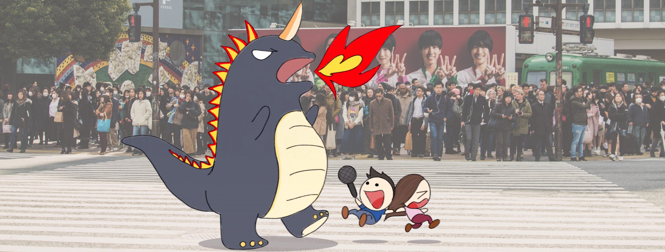
Now all I needed was to make it a square and ensure that there’s just one single focus point. I also wanted to add the full title of my show as well so people won’t miss them.
So I did some final touches: 🤓Set the presentation software slide dimension to 1400x1400px as required by Apple Podcast.
Adjusted the frame to focus on the characters.
Blurred the distracting background using Photoshop.
Isolated the fire and reposition it to point towards the character since it had the highest attention hierarchy (flashy).
Added the full title text below with a high contrast background.

And this is my final DIY cover art design, without the labels, at 80x80px.
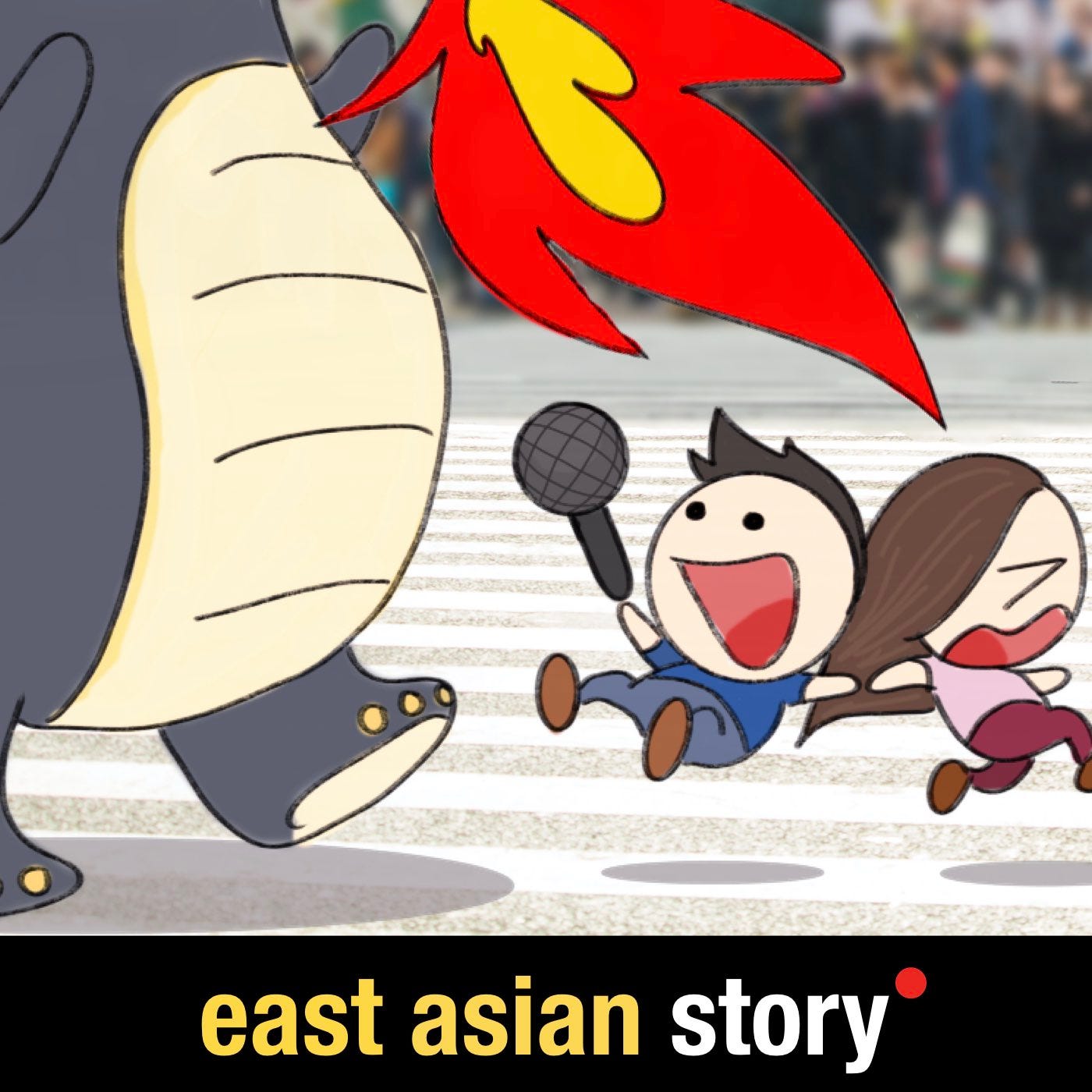
It’s not perfect; it’s a bit messy and complex. Remember, it’s homemade. 😳
Perhaps when I settle on it permanently I might send it to a professional graphic designer for a proper upgrade. But for now this is interesting enough and will do.
Thanks for reading! 🙏
Hope you took away some inspirations to create your own. 🙂
We believe in quality over quantity. These pieces take WEEKS of care to craft and maintain. Subscribing and SHARING keeps us pumped and helps us in a long way! 🙇🏻♀️❤️🙇🏻♂️